Ever wondered how a splash of color can instantly transform the vibe of your home’s exterior? House exterior color schemes have become a favorite way for homeowners to express personality, boost curb appeal, and create a welcoming atmosphere that reflects their style. From cheerful yellows to tranquil blues, choosing the right hues can turn your house into a joyful haven that stands out beautifully in the neighborhood.
In this article, you’ll find a wealth of inspiration and practical ideas to help you select the perfect exterior colors for your home. Whether you’re aiming for a bold statement, a calming pastel palette, or a nature-inspired look, we’ve got you covered with a variety of schemes that radiate happiness and charm.
Get ready to discover colorful combinations that will make your home not only eye-catching but also a true reflection of your joyful spirit! Adding bright yellow accents to your home’s exterior instantly creates a lively, welcoming vibe that radiates happiness. This color choice is perfect for those who want to turn their home into a cheerful focal point on the street, especially in dull or overcast climates where a splash of sunshine can lift spirits.
Imagine a house painted in a soft, neutral base such as warm beige or light taupe, with bold yellow shutters, a bright yellow front door, or cheerful yellow window frames. The textures of these accents—perhaps painted wood or decorative ceramic tiles—catch the light, adding visual interest.
The overall effect is vibrant yet balanced, with the yellow serving as a joyful highlight without overwhelming the senses. The scent of fresh paint or new wood can mingle with the outdoor breeze, creating an uplifting sensory experience.
To recreate this look, start with a neutral-colored house, like light gray or cream. Select one or two yellow elements, such as shutters or a door, using high-quality exterior paint designed for durability.
For a more playful touch, incorporate yellow decorative planters or outdoor cushions on porch furniture. Remember to choose weather-resistant materials and finish with a clear sealer to protect your colorful accents from the elements, ensuring your home stays cheerful year-round.
2. Soft Pastel Palette for a Calm and Joyful Facade
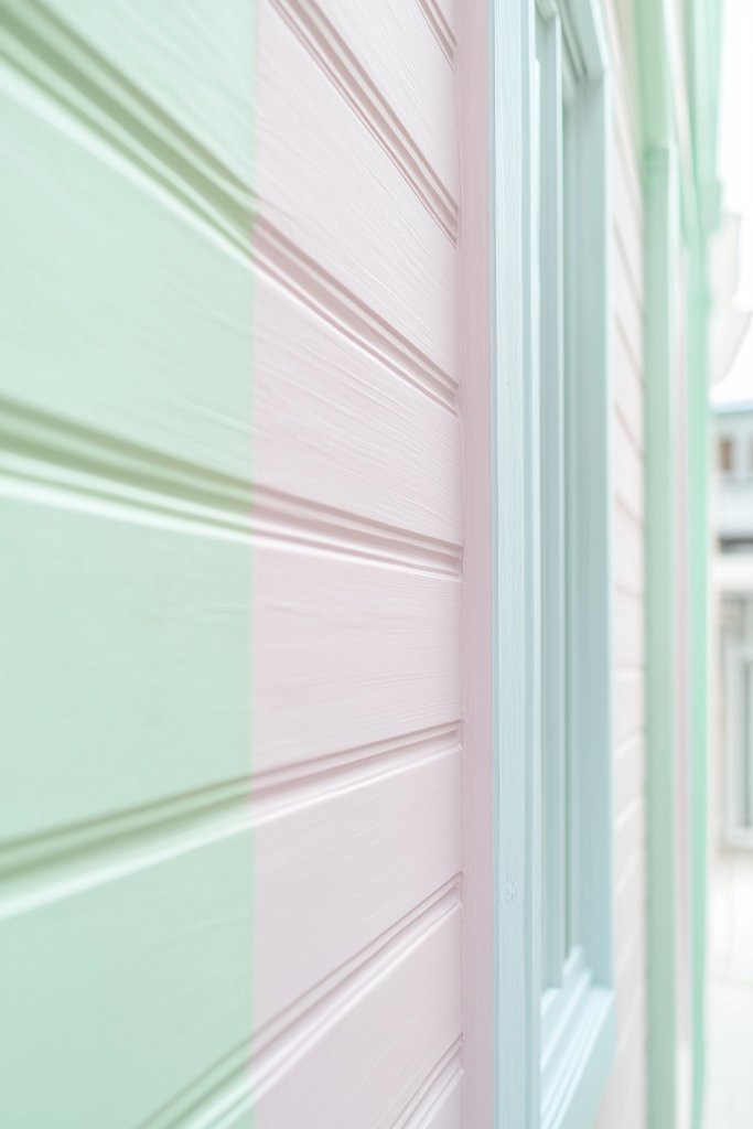
A pastel color scheme exudes serenity and joy, perfect for creating a tranquil yet inviting exterior that feels both soothing and uplifting. Soft shades like mint green, blush pink, lavender, or powder blue lend a gentle charm that appeals to those seeking a peaceful home environment.
Visualize a cozy cottage with mint green walls, complemented by blush pink shutters and a lavender front door. The textures are smooth, matte finishes that reflect the soft pastel palette, with subtle grain or stucco surfaces adding depth.
The overall look feels light and airy, almost as if the house is wrapped in a gentle, calming cloud. When sunlight hits these colors, they glow softly, enhancing the tranquil mood and inviting neighbors to stop for a friendly chat.
To achieve this aesthetic, choose high-quality exterior paints in pastel shades, ensuring they are suitable for your climate. Start with a neutral base, like off-white or light gray, then add your pastel accents on doors, shutters, or trim.
Use matte or satin finishes for a soft look, and incorporate textured elements like clapboard siding or shingle accents for added visual interest. Finish with weatherproof sealers for longevity, and select durable hardware in soft metallic tones like brushed nickel or matte black to complement your pastel palette.
3. Vibrant Red and Coral Combinations for a Bold Statement
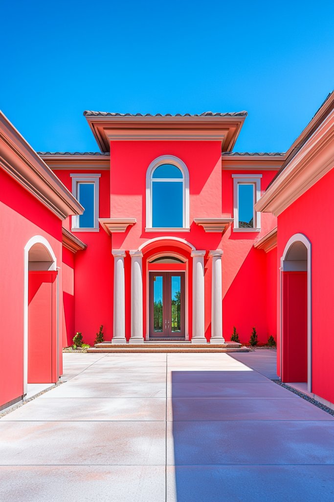
A house painted with bold reds or coral hues commands attention and injects energy into its surroundings. When paired with neutral trims, these fiery colors create a dynamic, eye-catching facade that expresses confidence and personality.
Picture a striking coral exterior with white trim, accented by deep red shutters or a bright red front door. The textures of these paints are glossy or semi-glossy, making the colors pop even more under sunlight.
This combination evokes warmth, vitality, and a sense of fun, perfect for homeowners who love standing out and making a statement. The vibrant colors reflect a lively personality, turning your home into a cheerful landmark that radiates positivity.
To implement this scheme, start with a high-quality exterior paint in your chosen bold color—whether it’s a vivid coral or a rich red. Keep trims in classic white or a neutral tone like taupe to balance the boldness.
Use durable, weather-resistant paints designed for exterior use, and consider adding decorative elements like matching planters or a porch swing in complementary shades. For a modern twist, incorporate metallic hardware or glass lanterns to enhance the vibrant look while maintaining elegance.
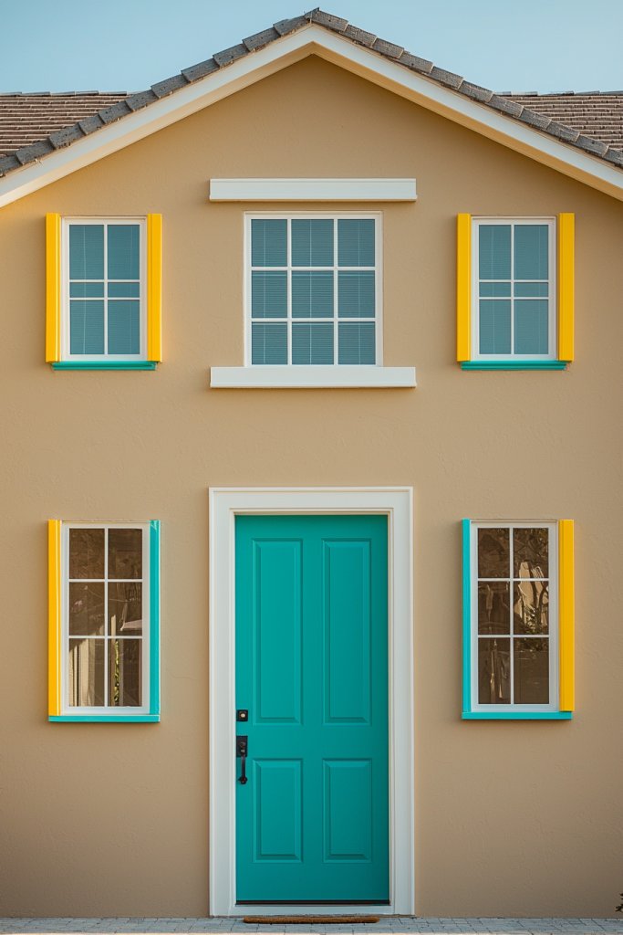
4. Classic White with Colorful Door Highlights
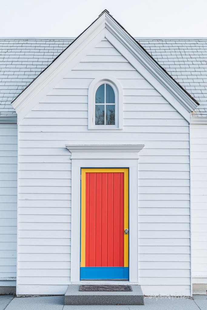
A crisp white exterior creates a timeless, fresh canvas that makes any colorful door or trim pop with joyful energy. This versatile scheme is perfect for blending classic elegance with a splash of personality, making your home inviting and cheerful.
Visualize pristine white walls with brightly colored doors—perhaps a vibrant turquoise, sunny yellow, or fiery red—serving as the focal point. The clean, smooth surface of the white exterior acts as a backdrop that accentuates these colorful highlights.
The contrast sparks visual interest, while the overall look remains fresh and sophisticated. The combination of white with pops of color exudes a sense of clarity and happiness, perfect for enhancing curb appeal.
To recreate this look, paint your house in a durable, high-quality white exterior paint. Use bold, weather-resistant hues for your front door, such as electric blue, sunny yellow, or cherry red.
Add matching or contrasting shutters and window frames to tie the look together. Finish with white trim and accents to keep everything cohesive. Consider decorative elements like planters, outdoor rugs, or seating in complementary colors for additional joyful touches, ensuring your home’s exterior stays bright and welcoming for years to come.
5. Earth Tones with Warm Orange and Terracotta Touches
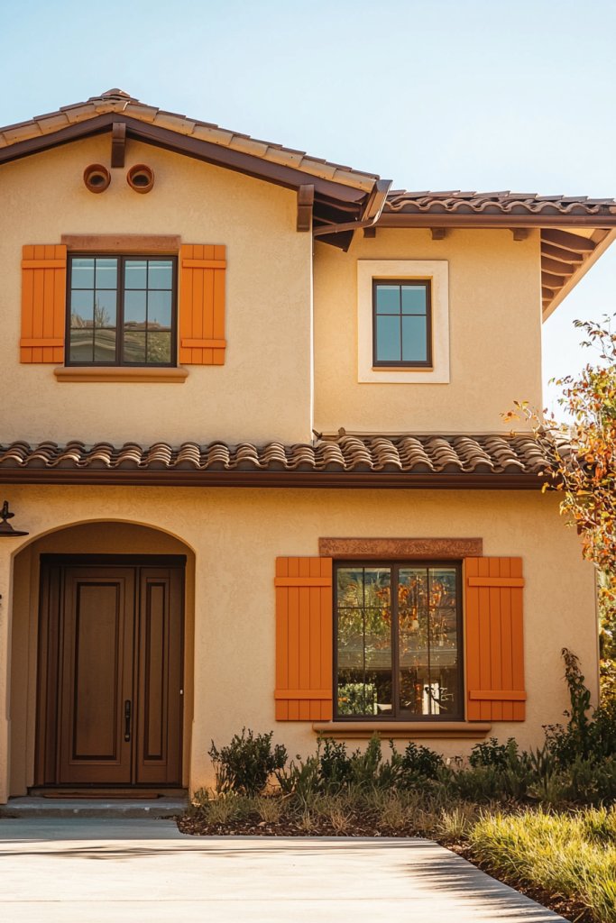
Earth tones create a cozy, inviting exterior rooted in nature, with warm orange and terracotta accents adding a cheerful, uplifting vibe. This palette evokes feelings of comfort and stability, perfect for blending your home into its natural surroundings while maintaining a joyful appearance.
Imagine a house with warm beige or taupe walls, complemented by terracotta-colored shutters, trim, or a front door. The textures of these materials—such as stucco or wood—bring a tactile richness that enhances the warm, earthy feel.
The orange and terracotta accents reflect the colors of sunset or autumn leaves, infusing the exterior with natural vibrancy and warmth. This scheme fosters a welcoming atmosphere that feels both grounded and joyful.
To achieve this look, start by choosing a neutral base like light brown or sandy beige. Add terracotta-colored elements using weatherproof exterior paint or ceramic tiles for doors, shutters, or decorative accents.
Incorporate textured materials like clay pots, woven baskets, or stone pathways to complement the earthy tones. Finish with durable sealers and rust-resistant hardware in bronze or matte black for a cohesive, long-lasting exterior that celebrates the natural palette. These expanded descriptions aim to inspire homeowners to creatively incorporate joyful color schemes into their house exteriors, balancing aesthetic appeal with practical implementation tips.
6. Cool Blues and Turquoise for a Refreshing, Joyful Vibe
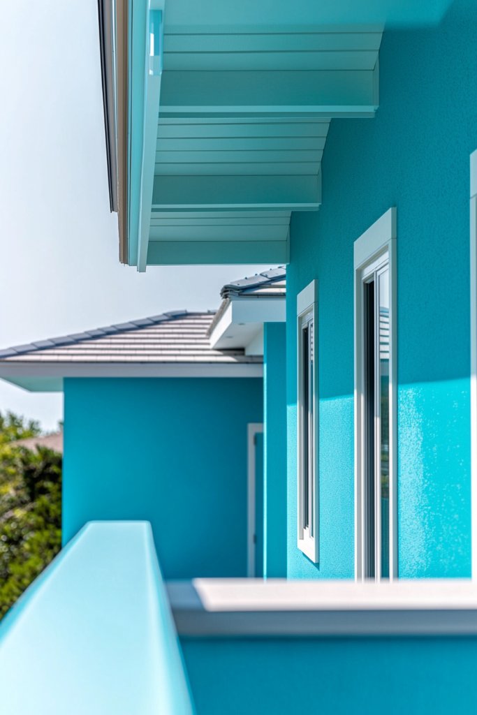
A home painted in cool blues and turquoise instantly evokes feelings of calm, serenity, and happiness—perfect for creating a refreshing exterior that invites relaxation. These shades mimic the tranquil ocean or clear skies, bringing a sense of openness and freshness to your home’s curb appeal.
Imagine standing in front of a house with a soft, sky-blue façade, complemented by darker navy trim that adds depth and contrast. The turquoise accents on shutters or a front door glow vibrantly against the lighter walls, while the smooth matte finish enhances the soothing texture.
The overall look feels breezy and uplifting, almost as if summer breezes are constantly wafting past. Natural materials like whitewashed stone or weathered wood add texture, making the exterior feel lively yet peaceful.
To achieve this look, start with a base of light blue or turquoise exterior paint—look for high-quality, weather-resistant options like Sherwin-Williams’ “Sea Salt” or Benjamin Moore’s “Caribbean Blue.” For trims, choose darker navy or teal shades to create contrast. Use weatherproof exterior brushes and rollers for smooth application, and consider sealing the paint with a clear weatherproof finish for longevity. Adding coastal-inspired accessories such as white shutters or ceramic lanterns completes the vibe, making your home a cheerful retreat.
7. Bold Black and Bright White Contrast for Modern Elegance
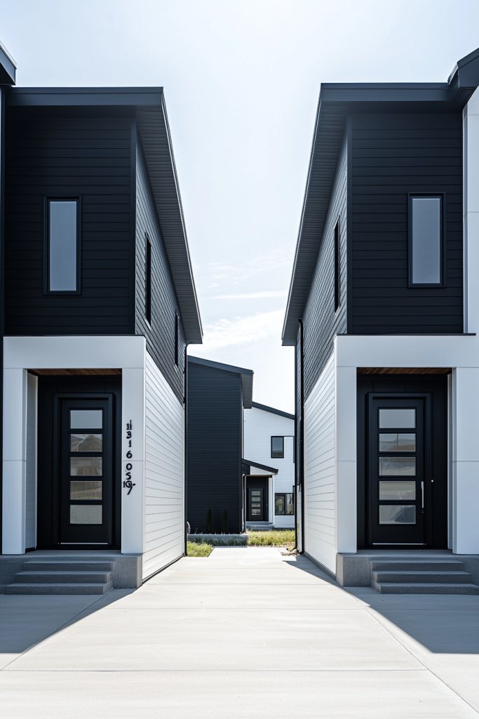
A striking black-and-white exterior radiates modern sophistication while radiating joy through its crisp, clean aesthetic. This high-contrast palette makes architectural details pop and creates an energetic, contemporary vibe that’s both timeless and eye-catching.
Visualize a sleek, matte black facade with bright white trim outlining windows, doors, and rooflines. The black walls absorb light, giving a bold, dramatic backdrop, while the white accents add a fresh, lively contrast that emphasizes the home’s structure.
Textural elements like white vertical siding or smooth black stucco combined with white window frames and door trim create a dynamic interplay. The overall effect is both polished and inviting; it feels modern yet welcoming, especially when complemented by subtle lighting that highlights the contrast at night.
To bring this look to life, choose high-quality exterior paints—such as Benjamin Moore’s “Black Satin” or Sherwin-Williams’ “Tricorn Black”—that withstand weather conditions. For the white details, opt for durable exterior white paints like Sherwin-Williams’ “Alabaster.” Use painter’s tape for crisp lines and invest in quality brushes and rollers. Finish with minimalist outdoor lighting and sleek accessories like concrete planters or modern sculptures to enhance the contemporary appeal and joyfulness of your exterior.
8. Natural Wood Tones Paired with Soft Neutrals

Combining warm natural wood with soft neutrals creates an inviting, cozy exterior that feels both grounded and joyful. This look emphasizes natural textures and tones, giving your home a harmonious, organic charm.
Picture a home with siding or accent panels in warm cedar or teak, paired with beige or taupe stucco walls. The textured wood adds visual warmth and tactile richness, while the neutral base keeps the overall look calm and sophisticated.
Small details like wooden shutters, a front porch railing, or a rustic wooden door enhance the natural vibe, inviting touch and comfort. This combination exudes a peaceful, welcoming atmosphere, perfect for homes in suburban or rustic settings.
To achieve this aesthetic, start with stain-treated wood—options like semi-transparent cedar stain or natural oil finishes—to highlight the grain. Use neutral exterior paints such as Sherwin-Williams’ “Accessible Beige” or Benjamin Moore’s “Revere Pewter.” For durability, apply weatherproof sealants to wood components and choose siding materials that mimic natural wood or reclaimed wood planks for sustainability and texture. Complement the look with cozy textiles, such as a soft cream throw blanket or natural fiber doormat, to complete the warm, joyful exterior.
9. Muted Greiges with Bright Colorful Accents
A sophisticated neutral greige exterior serves as the perfect backdrop for lively, cheerful accents that add personality and joy. This balanced approach creates an elegant, welcoming home with subtle vibrancy.
Visualize a muted, warm gray-beige façade with a bright red front door or vivid yellow shutters that instantly draw the eye and lift the mood. The neutral walls provide a calm canvas, while pops of color on the door, window frames, or decorative accessories inject energy and fun.
The texture of smooth stucco or fiber cement siding paired with the glossy finish of painted accents creates visual interest. The overall effect feels modern yet approachable, making your home both stylish and joyful.
Begin with greige exterior paint like Sherwin-Williams’ “Accessible Gray” or Benjamin Moore’s “Revere Pewter.” For accents, select bold colors like citrus orange, turquoise, or sunny yellow—use exterior-grade paints for durability. Keep the application simple with brushes and rollers, and add colorful outdoor cushions, ceramic planters, or lanterns to amplify the cheerful vibe. This easy-to-achieve scheme allows for endless personalization and a joyful, sophisticated exterior.
10. Jewel-Toned Facades for a Luxurious, Happy Look
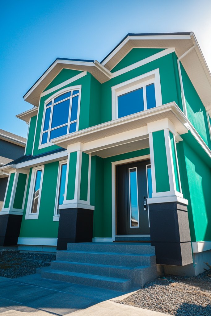
Jewel tones on your exterior walls evoke richness and happiness, transforming your home into a regal yet cheerful retreat. These vibrant shades add depth and elegance, creating a striking visual statement.
Picture a deep emerald green or sapphire blue façade, accented by metallic or neutral trim. The glossy or matte finish enhances the richness of the color, while architectural details like arched windows or ornate moldings add to the luxurious feel.
Complementary accents—such as bronze hardware or plush outdoor cushions—bring in tactile richness that invites touch and admiration. The overall aesthetic exudes confidence and joy, making your home stand out beautifully.
To recreate this look, choose high-pigment exterior paints like Sherwin-Williams’ “Emerald Green” or Benjamin Moore’s “Sapphire” with excellent coverage and weather resistance. Use metallic or neutral trims—think brushed gold or warm taupe—to frame the bold colors.
Apply with professional brushes or rollers, ensuring smooth, even coverage. Finish with luxurious accessories, such as velvet outdoor cushions or decorative lanterns, to amplify the jewel-tone elegance and joyful atmosphere of your home’s exterior.
11. Two-Tone Color Schemes for Visual Interest and Joy
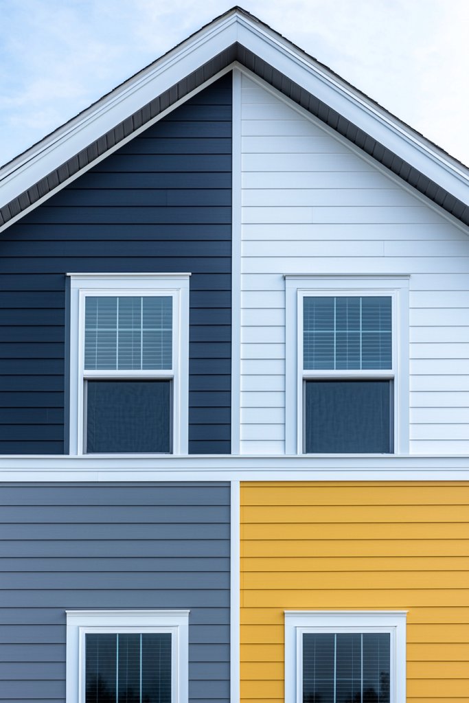
A two-tone color scheme is a simple yet powerful way to add depth and personality to your home’s exterior, instantly elevating its curb appeal with a playful touch of contrast. This approach breaks up large wall surfaces, creating a dynamic and inviting facade that draws the eye and sparks curiosity.
It’s an excellent choice for homeowners eager to experiment with color without overwhelming the overall look. Imagine a charming cottage with soft, muted gray on the upper half of the walls paired with a warm, sunny yellow on the lower half.
The colors are separated by a crisp white trim, emphasizing the contrast and adding a clean, polished finish. Alternatively, a modern home might feature a deep navy on the main surfaces combined with light beige accents, giving a sophisticated yet joyful vibe.
The key is balancing the hues to enhance architectural features and create a lively, welcoming atmosphere. Textural elements like clapboard siding, stucco, or stone can further enhance the visual interest, making the two-tone palette feel layered and intentional.
When lighting hits these colors, they reveal their true vibrancy, transforming the house into a cheerful landmark in the neighborhood. Getting started is straightforward: choose two complementary colors that reflect your style and mood.
Use painter’s tape to section off areas for clean lines, and invest in high-quality exterior paint—matte or satin finishes work well for a soft, inviting look. For a budget-friendly option, consider using leftover or discounted paint samples.
Don’t forget to add a bright-colored door or shutters in a third, bold hue to complete the joyful effect. With a little prep and patience, you can craft a striking, personalized exterior that’s both fun and sophisticated.
12. Playful Brights for a Whimsical, Joyful Home
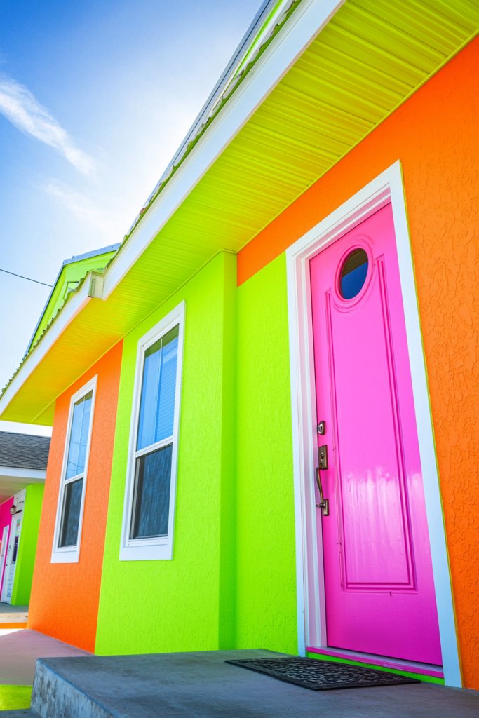
Injecting bright, unexpected colors into your home’s exterior instantly creates a whimsical, joyful vibe that stands out in any neighborhood. Think vibrant lime green, sunny orange, hot pink, or electric blue—these hues evoke happiness and energy, perfect for homeowners who love to express their personality.
Bright colors can be applied to entire facades or just to key details like doors, shutters, or trim, making your home a cheerful beacon of creativity. Picture a cozy house painted in a cheerful coral with a turquoise front door and bright yellow shutters.
The combination bursts with life and invites smiles from passersby. To add to the playful atmosphere, incorporate colorful outdoor furniture, planters, or decorative ceramic objects in matching lively hues.
The textures of the exterior—smooth painted surfaces contrasting with glossy or matte finishes—heighten the visual impact. Even in cloudy weather, these colors radiate warmth, creating an uplifting environment that feels both fun and welcoming.
The key is balancing boldness with harmony, ensuring the colors enhance architectural details rather than overpower them. Implementation is simple: select a bold color palette that makes you happy—consider paint samples or small accent areas first to test how the colors look in natural light.
Use painter’s tape for crisp edges and apply two coats for vibrancy. For added fun, paint your front door in a contrasting hue or add colorful outdoor cushions and accents that complement your main color scheme. This approach allows for a playful yet cohesive exterior that expresses your joyful personality and brightens your entire street view.
13. Subtle Neutrals with Bright Door and Window Frame Accents
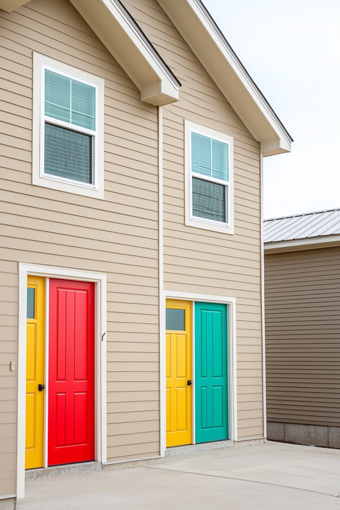
A subtle neutral palette paired with vibrant door and window frame accents offers a balanced, joyful exterior that exudes sophistication and charm. This style relies on understated base colors like soft beige, warm taupe, or light gray to create a calm, inviting backdrop.
Brightly colored doors or shutters in shades like turquoise, coral, or lime serve as eye-catching focal points that instantly lift the mood and add personality. Visualize a home with smooth taupe walls, complemented by crisp white window trims and a cheerful red front door.
The neutral background provides a timeless, versatile canvas, while the colorful accents inject energy and joy into the overall look. Textural details such as stone veneer or textured siding soften the neutral tones, making the exterior feel warm and welcoming.
When sunlight hits these colors, the vibrant accents glow, creating a lively contrast that draws attention without overwhelming the senses. This approach makes your home stand out with a cheerful, polished appearance that remains elegant and adaptable across seasons.
To recreate this look, start with a neutral base—choose high-quality exterior paint in shades like greige or soft taupe. Then, pick a bright, bold color for your door and window frames, such as sunny yellow or bright teal.
Use painter’s tape for precise edges and apply at least two coats for durability and vibrancy. Add decorative elements like a colorful doormat, planters, or house numbers to further enhance the joyful vibe. This straightforward, stylish scheme offers a harmonious balance of subtlety and playfulness, perfect for a welcoming home that radiates happiness.
14. Coastal-Inspired Blues and Whites for a Relaxing, Happy Vibe
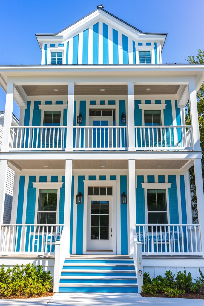
A coastal-inspired exterior palette of blues and whites instantly evokes feelings of calm, happiness, and seaside relaxation. This classic combination is ideal for creating a fresh, airy look that makes your home feel like a vacation retreat.
Think crisp white walls paired with soft sky blue, navy accents, or turquoise details—these colors work together to produce a tranquil yet joyful atmosphere. Picture a beach cottage with pristine white clapboard siding accented by a powder blue front door and navy trim around windows.
The textures—smooth paint, weathered wood, and glossy ceramics—add to the sensory richness, reminding you of ocean breezes and sandy shores. When sunlight hits this color scheme, the blue shades shimmer, enhancing the relaxing vibe, while the white reflects light, making the space feel bright and open.
This style suits homes in coastal or lakeside settings but also lends a fresh, summery feel to any suburban neighborhood. The overall effect is soothing, cheerful, and timeless.
Recreating this look is accessible: start with white exterior paint as your base, adding soft blue or turquoise accents on your door, shutters, or porch furniture. Use weather-resistant paints for durability, and consider adding natural textures like woven rugs or driftwood-inspired decor to complete the seaside aesthetic.
Incorporate subtle nautical elements—rope details or shell accents—for extra charm. With simple tools and a few paint cans, you’ll transform your home into a bright, happy escape that invites relaxation and joy every day.
15. Vintage Palette with Soft Mint and Rose Hues
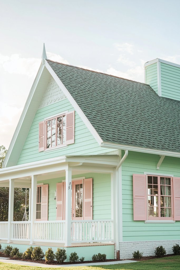
Transform your home’s exterior into a charming vintage-inspired sanctuary by embracing a soft mint and rose color palette that exudes nostalgia and warmth. This gentle combination creates a welcoming atmosphere that feels both timeless and uniquely personal, perfect for adding character and joy to your home’s facade.
Imagine a house painted in a delicate, muted mint green that subtly catches the light, paired with warm rose-hued accents on shutters or trim. The mint walls are smooth with a matte finish, evoking a sense of calm and freshness, while the rose-colored details—perhaps on the front door or window frames—bring a soft, romantic glow.
Complement this palette with vintage-inspired ceramic house numbers, a cozy textured doormat in cream or blush, and a charming wrought-iron lantern hanging near the entrance. The overall look feels nostalgic yet refreshing, inviting visitors to step into a storybook scene filled with gentle hues and tactile warmth.
To recreate this vintage-inspired exterior, start with a high-quality exterior paint in soft mint and rose tones—these can be found in many eco-friendly brands or mixed at specialty paint stores. For the accents, consider using durable ceramic or enamel finishes on the door and trim, or opt for weather-resistant decorative metal fixtures painted in coordinating shades.
Apply the paint smoothly with brushes or rollers, and add small vintage-style accessories like ceramic planters or a retro mailbox for extra charm. With a few simple tools, some thoughtful color choices, and attention to detail, you can transform your home into a nostalgic haven that radiates joy and timeless elegance.
16. Monochromatic Shades with Textural Variations for Depth and Joy
A monochromatic color scheme infused with rich textures can transform your home’s exterior into a sophisticated yet joyful statement. This approach uses different shades of a single color—think varying tones of soft blush pink or deep navy blue—creating visual interest without overwhelming the senses.
When combined with diverse materials like smooth stucco, rough stone, or sleek metal accents, it invites both the eye and the touch to explore the surface layers of your home. The subtle shifts in hue paired with textured finishes evoke a sense of depth and warmth, making your house feel inviting and lively.
Imagine walking up to a home where the walls are painted in a gentle, muted taupe, but the surface varies from matte to semi-gloss, highlighting architectural details with a play of light and shadow. The front door, painted in a slightly darker shade of the same hue, features a textured wood grain or a woven rattan insert, adding tactile contrast.
Soft neutral tones like beige or greige, combined with textured elements such as brick or shiplap siding, create a layered look that feels both modern and timeless. The overall effect is a harmonious, joyful exterior that feels thoughtfully curated yet effortlessly inviting.
To recreate this look, start by choosing a single dominant color that resonates with your style—such as warm terracotta or cool slate gray. Use different shades of this color for walls, trims, and accents, ensuring a smooth gradient from light to dark.
Incorporate textured siding, stone veneer, or decorative trim to add depth. Apply paint with varied finishes—matte, satin, or semi-gloss—to enhance the tactile experience. Combining these elements with simple, neutral-colored decorative objects like ceramic planters or woven porch furniture will complete your layered, joyful exterior.
17. Bright Monochrome with Complementary Trim Colors
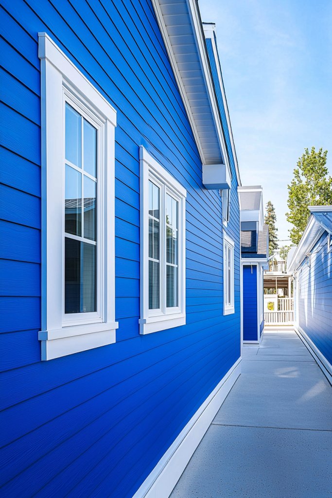
A bold, single-color exterior accented by contrasting trim can create a lively and cohesive aesthetic that radiates joy. Think of a vivid cobalt blue home with crisp white window frames and a bright yellow front door—this striking contrast instantly energizes your curb appeal.
Using one dominant hue for the main surfaces simplifies decision-making, while the complementary trims add a playful pop that highlights architectural features and adds visual interest. This approach is both modern and timeless, perfect for homeowners seeking a cheerful, standout look.
Picture a house painted in a vibrant emerald green, with white trim outlining the windows and door frames, and a sunny orange front door to serve as a cheerful focal point. The clean lines of the contrasting colors emphasize the home’s shape, while the bold color palette evokes feelings of happiness and freshness.
The glossy finish on the trims reflects sunlight, adding a lively sparkle to the exterior. This design creates a lively, joyful atmosphere, making your home feel welcoming and full of personality.
To implement this scheme, pick a dominant color that suits your style—such as bright red, turquoise, or sunny yellow—and then choose trims in contrasting colors like white, black, or a complementary shade in the color wheel. Use high-quality exterior paint with a semi-gloss or gloss finish for trims to maximize visual impact.
Carefully tape and prep your surfaces, then apply the paint in smooth, even coats. Finish with decorative touches like brightly colored planters or outdoor furniture in coordinating hues to reinforce the joyful, monochrome theme.
18. Color Blocking with Complementary Shades for a Modern Joyful Style
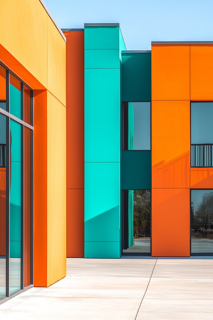
Color blocking is an eye-catching technique that involves dividing your home’s exterior into large, bold sections of contrasting colors, creating a vibrant, contemporary aesthetic. This approach emphasizes geometric shapes and clean lines, giving your house a modern, playful personality.
By selecting colors from opposite sides of the color wheel—such as deep purple and bright yellow or navy and coral—you achieve a striking visual balance that exudes energy and joy. This technique works especially well on homes with simple architectural lines, allowing the colors to do the talking.
Envision a home with the upper half painted in a rich, deep blue, while the lower half is a cheerful, sunny yellow. The division between the colors is crisp and straight, accentuated by a sleek, contrasting trim or a narrow band of neutral material like concrete or stone to separate the sections.
The large color blocks create a bold statement that catches the eye from a distance and energizes the entire street view. The combination of vivid hues and geometric design produces a modern yet welcoming exterior full of personality and cheerfulness.
To achieve this look, start by choosing two or three bold, contrasting colors that fit your personal style and neighborhood vibe. Use painter’s tape to mark crisp lines along your home’s facade, ensuring straight, even edges.
Carefully apply exterior-grade paint with a roller or brush, working from the top down and maintaining sharp lines. Finish by adding simple decorative elements such as bright porch furniture, colorful planters, or textured sidings that complement the color blocks. This straightforward yet striking method guarantees a joyful, modern aesthetic that stands out beautifully.
19. Nature-Inspired Hues with Accents in Soft Neutrals
Drawing inspiration from the natural world, this exterior color scheme uses earthy shades like moss green, sandy beige, or sky blue, complemented by soft neutral accents for a harmonious, grounded, yet joyful appearance. These colors evoke feelings of calmness and connection to nature, creating an exterior that feels both peaceful and lively.
Subtle variations in hue mimic the gentle shifts seen in landscapes, while accents like light-colored trims or decorative stonework add visual interest and sophistication. Picture a home painted in a muted sage green, with accents of warm beige on window frames and a light tan front door.
The textured surfaces, such as rough stucco or wooden siding, enhance the natural feel, making the house blend seamlessly into its surroundings. Soft neutral accents—like cream-colored porch columns or stone veneer—serve as gentle highlights that keep the exterior feeling fresh and inviting.
The overall effect is a serene, joyful home that invites you to relax and enjoy its subtle beauty. To create this look, select a palette of earthy hues—such as moss, sand, or sky—using high-quality exterior paints designed for durability.
Incorporate natural materials like siltstone, weathered wood, or ceramic tiles to reinforce the organic theme. Use neutral trims in soft cream or light taupe to frame windows and doors, enhancing the layered, natural aesthetic. Finish by adding understated decorative elements like textured ceramic planters or rustic lanterns, which complement the earthy tones and foster a welcoming, joyful ambiance.
Conclusion
With so many joyful exterior color schemes—from cheerful yellows and soft pastels to bold reds, calming blues, and vibrant color blocks—there’s a perfect palette to reflect your home’s personality and brighten your daily life. Don’t be afraid to experiment with these ideas and make your house a true expression of happiness and warmth.
Embrace the opportunity to transform your home’s curb appeal into a vibrant, inviting sanctuary. Start planning your colorful makeover today and let your home radiate joy!
Leave a Reply